Mapping renewable power plants in Argentina — Dynamic SVG marker creation in folium

· 9 min read
While going through some Kaggle exercises on data analysis, I found out about the folium library. It is quite an interesting tool, allowing you to add layers to existing open-source maps and display them on HTML.
I decided to create a map to show some data from my country. I found this dataset that contains data about every renewable energy project that the country manages. Sadly this means that shared projects such as Yacyretá, managed by Argentina and Paraguay, are not present in the dataset.
The dataset is available here.
I used Python and the folium library to show the data. Folium generates leaflet code, an excellent mapping library. A jupyter notebook with the code is available in my repository, here.
The dataset contains many columns but I used only the following ones:
Avance: this is a numerical column in the range 0–1 that tells us the percentage of completion of the project. 1 means a working, operative plant. 0.5 would mean that only half of the place has been built.
The dataset has 282 rows but I will be using only the plants that have more than 0 percentage of completion.
This data is not complete. It only includes some plants that are part of a project called “Renovar” that was operative a few years ago. In fact, many of the plants shown on the map as “in construction” are not in active construction right now.
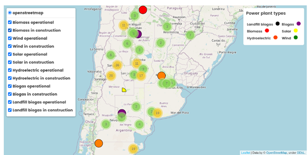
I decided to show the different types of plants using different colors. The amount of power and name of the plant would be shown in a popup when clicking on a marker. Marker cluster groups markers that are close when the map is seen at a low zoom level. This results in a map that has little clutter on it.
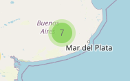
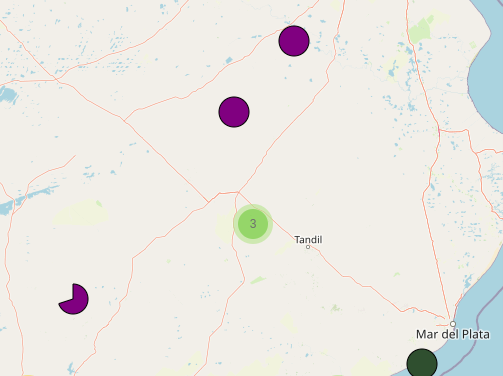
Something in the last picture may have caught your eye. Why do we have that “PacMan” shaped marker?
That is the way I chose to showcase plants that are not fully finished. A partial circle. If a plant is only finished by 25%, only 25% of the circle will be shown.
Many tutorials go through the main stages of creating a map in folium. I will instead focus on slightly more complex issues that arise when trying to build personalized maps.
If you have never used folium, I can recommend the documentation. It is a very good starting point.
After plotting your data, you will usually have a set of layers. Every layer will have been added to the map, and every data point will be part of a layer. For this project, I have used MarkerClusters as layers, to combine these two utilities. MarkerClusters behave like layers in every regard and add extra functionalities. I trust that you will manage to do this part with no complications and if they arise, there are good resources online on how to handle them.
The complex part for me started when I wanted custom markers that would be different depending on the data. The goal for the markers was to show the completeness of each project on partial circles. One approach, of course, would be to pre-render 100 partial circles with different levels of completeness.
This approach is not as bad as it may seem. These images would be fairly small, and you could pick them from an array and use them. However, I didn’t do this. I wanted to create the marker dynamically.
Folium allows you to use HTML to create a marker. This is a good start. You can make circles using just HTML, creating a div and playing with its border-radius. Googling a bit will also reveal different amounts of dark magic used that would let you build many different shapes just using HTML and CSS.
Instead, I decided to use SVG. It stands for Simple Vector Graphics and, as its name implies, it defines an image using vectors instead of pixels. This means that as long as you can represent your figure through some type of mathematical operation, you will be able to create a function that will give you your desired figure.
To understand how SVG works, I recommend this tutorial at w3schools. SVG has predefined operations as HTML tags. For example, you can make a circle like this:
<svgwidth="100"height="100">
<circlecx="50"cy="50"r="40"stroke="black"stroke-width="1"/>
</svg>
This gets us closer to the solution. SVG does have many tags to create different basic shapes. Sadly, you will soon find that to build complex images, you will need to combine the simpler tools. What is needed is a Path. It allows you to use basic shapes in succession to create your figure.
The link of w3schools should help you to get acquainted with the available shapes and how to represent them in SVG notation. This is the part when it gets a little daunting. This tool helps a lot in visualizing the results.
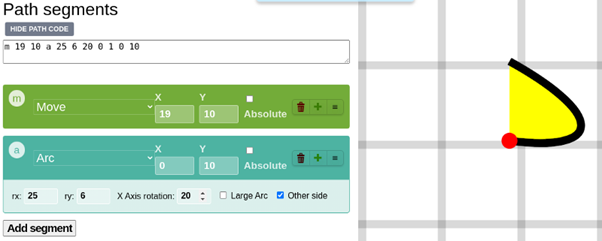
Making a circle section only required three SVG operations: Move, Line, and Arc. Let’s describe them:
Before jumping to the Arc, let us see some examples of these two operations:
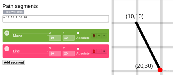
This screenshot comes from the tool I recommended for SVG Paths. In this path, we moved to the position (10,10), and from there, we drew a line 10 pixels below and 20 pixels to the right.
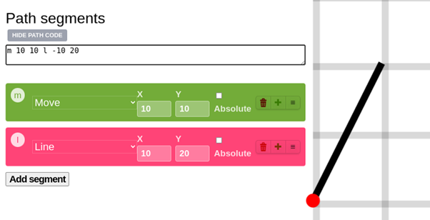
Every operator receives a position that is relative to the position of the pointer. The pointer starts at (0,0), the top left corner of the image.
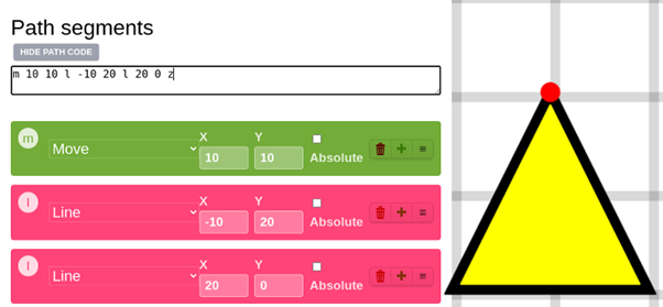
A final example of the usage of the line operator. In the end, I used the Z operator, which makes a line to the first position where something was drawn on the screen.
Now that we are more at ease with SVG (It took me more than just making a triangle to understand it, so I would totally understand if you want to stay here and play a bit with the other operators), we will jump to the Arc operator.
Arc radiusx, radiusy, x_axis_rotation, large_arc, direction, final_x, final_y
Let’s process this one parameter at a time.
Before we start, I will place this image showing the parts of an ellipse, to have a quick reference method:
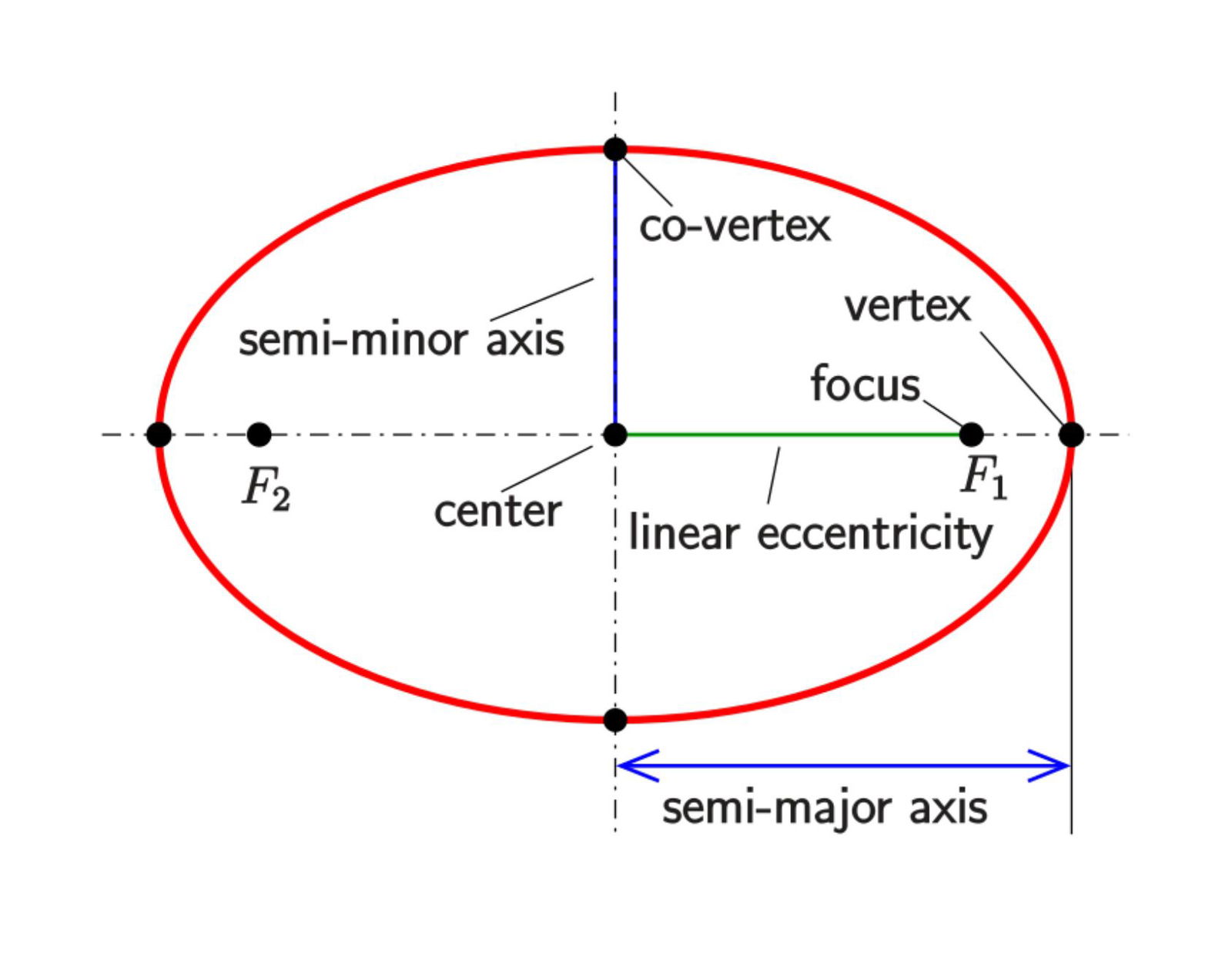
Radius_x defines, assuming an ellipse such as the one in the image, the distance between the center and the vertex. Radius_y is the distance between the center and the co-vertex. If these two values are equal, we will have a part of a circle. If not, we will have a section of the border of an ellipse.
Final_x and Final_y define the position of a point that belongs to the ellipse. Another point is given by the starting position of the SVG pointer. Having a start, an end, and two radius points, we have 4 possible arcs:
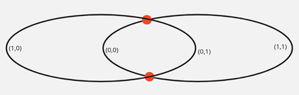
This image will help us to understand these two parameters. If large_arc is 0, it will consider these two points as being closer to the vertices of the ellipse. On 1, it will consider itself on the other possible position in the arc, farther away from its central point.
The direction flag will initiate the arc either clockwise or counterclockwise.
Finally, the x_axis_rotation value will rotate the vertices of the ellipse.
Now that we know how to use Move, Line and Arc, how do we use them to create our special marker?
The goal is, starting with a number that goes from 0 to 1, to have something like this:

Before executing the Arc, we need to move the pointer to the center of the circular section and create a vertical line. Then, we need a circular arc. Radius_x and radius_y will always be equal. No need to use x_axis_rotation either. The direction will always be clockwise. So we will only be interested in x, y, and large_arc.
Things do look simpler now, don’t they?
Going from a value in [0–1] to an angle in degrees would be the first step. 100% completion is 360º. 50% completion, 0.5, would be 180º. And so on.
Then, to get (x,y) coordinates, we convert our angle to cartesian coordinates, having a fixed norm, called radius in this function below.
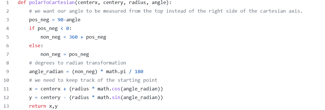
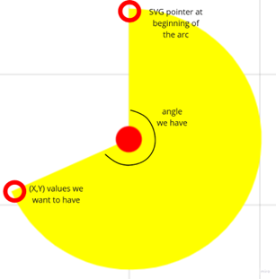
We need to keep track of the starting point because we don’t calculate the (x,y) position based on the current SVG pointer but on the center of the circle section. The following graph shows this:
We can define a function to make the whole SVG path now
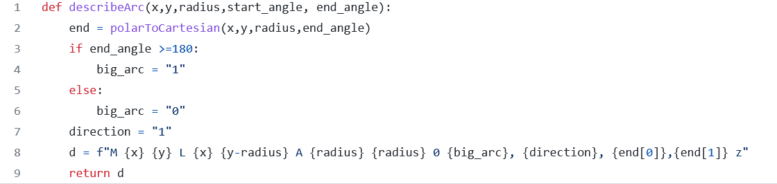
Some experiments led me to realize that if the angle goes above 180 you will need the big_arc flag to be 1. In hindsight, this is because whenever you go farther than 180 degrees, the center of the arc, transported to the ellipse in which the operation is based, would have to be closer to the vertex being drawn.
Now we can add our SVG to the markers:
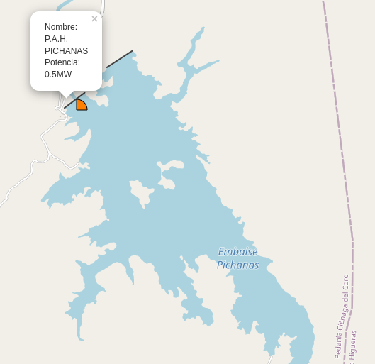
A marker in folium has many attributes. Location is quite mandatory. Popup will, as its name indicates, give us a small popup when we click on the marker.
Icon is the one we have been working towards. Here we pass a DivIcon instance, that can receive HTML as a parameter. Inside a div, we pass an SVG tag with the path that our function “describeArc” gives us.
Some of the errors I made while going through this:
The actual project includes multi-level layering using MarkerCluster and subselectors. The map was exported to HTML and added to my personal website. These other parts of the project are well explained on the folium docs and that is why I don't explain them here at length. You can check the final result here:
Hydroelectric Map of Argentina
Future Thought Leaders is a democratic space presenting the thoughts and opinions of rising Energy & Sustainability writers, their opinions do not necessarily represent those of illuminem.
Olaoluwa John Adeleke

Power Grid · Power & Utilities
Alex Hong

Energy Transition · Energy
illuminem briefings

Hydrogen · Energy
Financial Times

LNG · Oil & Gas
Oil Price

Renewables · Energy
Forbes

Energy Transition · Energy Management & Efficiency